March 25, 2014

Fair Housing Center of Central Indiana Conference Look

Final Design


My Personal Design Preference (Runner-Up)


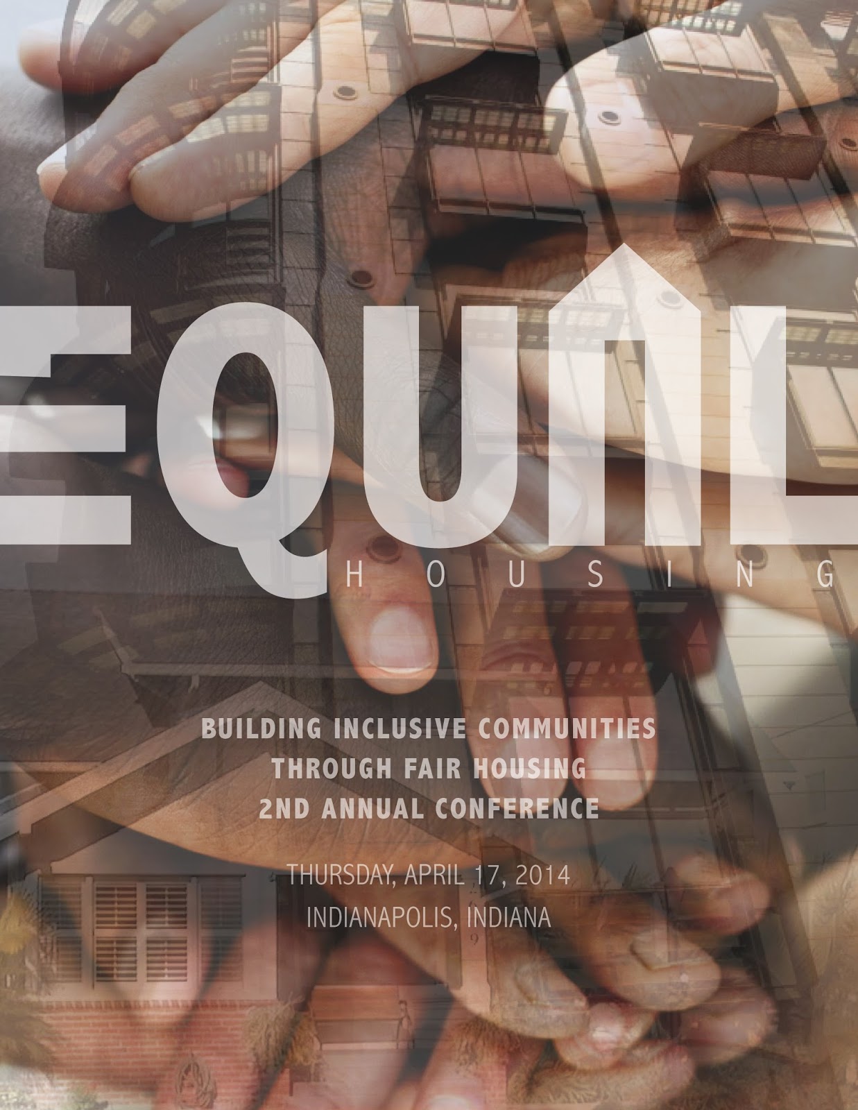
FHCCI Conference Look
I was hired as a freelance designer to create a look for the 2nd Annual Fair Housing Conference, hosted by the Fair Housing Center of Central Indiana (FHCCI). I competed against another artist for the final project, and was victorious. As a result, my design will be used as the conference program cover and for various marketing materials. In addition, the background will be utilized for the event's signage.

When given the opportunity to create this cover, I instantly gravitated toward my passion, graphic design and branding. At the center of any successful branding campaign is a strong logo. First, I began by creating a logo to explicitly express FHCCI's mission by modifying the text to incorporate an equal sign and house into the word "equal" itself and added the word "housing" underneath for clarification. The background combines layered images of different types of housing, which literally build a strong community, and hands of various races, which figuratively build a strong community. As the layered shades of brown create a strong composition, different races work together to build an enduring community.

March 23, 2014

The Mid-American Regional Center Branding

Business Card
Front (left) & Back (right)

Folder Outside
Front (right) & Back (left)

Folder Inside
(One Pocket)

Inside Content
Page 1

Inside Content
(Pages 2-3)

Inside Content
(Pages 4-5)

Inside Content
(Pages 6-7)

Projects Card
(Housed in Back Pocket)

Envelopes
9"x12" (left) & #9 (right)


Letterhead

Branding: The Mid-American Regional Center
The Mid-American Regional Center, or TMARC, is a group of lawyers that sets up and supports foreign investments in American companies. This new partner company of Taft's is set to launch in the late spring of 2014. As a part of Taft, its marketing department was tasked with branding the fledgling company. My boss, Maria Porter, designed TMARC's logo before I became an intern. However, the rest of the branding, including the business card and collateral items above, was left up to me. 

While associated with Taft, The Mid-American Regional Center is its own entity. To show this, I utilized a combination of strong diagonal and horizontal lines as key design elements. The diagonal lines promote this companies' connection by mirroring the flag's slant in TMARC's logo as well as reflecting the backslash in Taft's logo. In contrast, the horizontal lines reflect the flag's stripes, a design element unique to TMARC.

This project taught me a new skill, branding. While working with in-house marketing teams has given me a lot of experience upholding and designing within a pre-established brand image, this was my first real world experience creating something from scratch. Translating the TMARC image across multiple media presented challenges, allowing me to employ my design problem solving skills. While the project is still underway, it's rewarding to be the driving force behind TMARC's brand growth.

Spa Day Invite

Final Design
Runner-up 1
Runner-up 2 


Web Design: Spa Day Invite
Each year, Taft's Professional Women's Resource Group invites all its members to a spa day, free of charge. This year, I was assigned to create three invitation designs, the best of which would be sent to each of Taft's guests via email. First, I looked for images that evoked the feeling of inner-peace, serenity, and balance. These traits, commonly lost in the shuffle of every day life, are often restored as a result of a spa visit. Therefore, an invite should reflect them as well. 

Runner-up 1 features a right-side-heavy background image, providing balance to the copy on the left. The white and yellow text and opaque boxes give a the invite a softness, a calming effect. Runner-up 2 features an image as well, but is more graphic heavy than Runner-up 1. The lines not only mimic the bamboo, but are inspired by the patterns on Japanese folding and sliding screens, another element commonly associated with the zen and balance. The winning design, Final Design,  is a variation of Runner-up 2, as it utilizes the same image and a similar layout. However, rather than Japanese screens, it's inspired by the yin-yang, the Chinese symbol of balance. The circles reflect not only the yin-yang symbol, but the shape of the rocks as well, smooth and circular. In addition to the circles, the image and text layout contribute to the overall feeling of balance and serenity. The use of red, the footer, and logo keep the overall design well grounded in the Taft brand image. In combination, the invite has both the essence of the spa and Taft.

New Hire Announcements


Print Version

Web Version


Graphic Design: New Hire Announcements
Every time a lawyer becomes a part of the Taft family he/she receives an announcement, for both print and web. The announcement's information, provided by the new hire, includes a brief description of the position the new hire is filling, his/her contact information, and Taft's website. In the case of Marianne, there is also a brief description of Taft, its office locations, and practice groups. My role in announcement production included an exercise in information design across multiple platforms. Aside from making it look pretty, I was expected to present the information in an organized fashion that allowed its audience do easily distinguish which information is most important. Utilizing font size, color, weight, and line spacing, I was able to create flow, leading the audience through the information hierarchy with ease. These elements work with the image and border to create a dynamic, yet professional, announcement that falls within Taft's overall branding.

March 22, 2014

Fourth of July Envelope

Fourth of July Card

Final Envelope


Runner-Up Design


Stationery Design: Fourth of July Envelope
While the while the Fourth of July card was pre-designed, I was tasked with creating an envelope to match. First, I laid out the information necessary for a functioning envelope, such as the address lines, return address, and Taft's logo. Next, to make the separately designed pieces appear as a cohesive set, I borrowed design elements from the card, such as the blue stars and fireworks.  Finally, I arranged all the elements to create two dynamic design options, expressing the familiar fun atmosphere the fourth of July delivers.

March 20, 2014

Taft Closing Book Files Package

DVD Sleeve
DVD Sticker

Header

Table of Contents


Graphic Design: Taft Closing Book Files Package
While the closing book files templates were already pre-designed by my boss, Maria Porter, I was tasked with finding and inserting new skyline images for each of Taft's eight offices. I did this by looking through istockphoto.com and presenting my ideas and pricing information to head of marketing, Susan Kilkenny, for approval. Once a decision was reached, I purchased and inserted the new skyline images into each of the items above creating a complete package for each city. (All of the new skyline photos can be seen on Taft's website) I also inserted editable fields onto each of the PDFs, making them easily customizable to each project.

Law Update Rebrand


Web Design: Law Update Rebrand
Taft is in the process of rebranding their Law Update, or email updating both internal and external audiences on happenings at Taft and in the general law community. While the process is still underway, above are three of the designs I submitted to the marketing team for review. Each design is in line with Taft's overall bold simplistic branding and communicates the necessary information clearly and concisely.

Taft Ad: City Year Cleveland

Final Ad


Runner Up Designs


Graphic Design: City Year Cleveland Ad
A common task I'm assigned at Taft Law is creating various ads for the firm including sponsorship, announcement, and B2B. This ad specifically emphasizes Taft's sponsorship of City Year Cleveland. Visually, Taft employs clean simple design utilizing bold line and color. In the final ad, I mirror the back-slash of the Taft logo to emphasize the copy and lead the eye from the big slash and copy to the smaller slash and logo.

Butler Social Media Website Mock-Up


Web Design: Butler Social Media Website Mock-Up
I was tasked with creating a mock-up design for a website to specifically house Butler University's many social media vehicles. It was to mirror some aspects of Butler's main website, while holding an identity of its own. 

Butler MFA Blog Button

Butler's MFA Blog
Original Banner
My graphic on the MFA Blog
Button linking butler.edu/english to the MFA Blog


Web Design: MFA Blog Button
A common task I encounter interning with Butler's Web Marketing Department is creating  graphics to act as buttons or links on various pages of Butler's website (www.butler.edu). In this case, I was tasked with creating an image linking Butler's MFA in Creative Writing site to the MFA Blog. I was provided with the banner to the MFA blog homepage and asked to create a button with the same look.


Butler Events Site Banners


Web Design: Butler Events Site Web Banners
A common task I encounter interning with Butler's Web Marketing Department is creating events site banners for Butler's website (news.butler.edu/events). I'm provided with copy to include and the blank template including size and the 'read more' button. Image selection and layout are my responsibility.