
February 10, 2015
Current Work on New Website
I have a new website! For my current portfolio, visit, www.AmberMillsPortfolio.com.
March 25, 2014
Fair Housing Center of Central Indiana Conference Look
 |
| Final Design |
 |
| My Personal Design Preference (Runner-Up) |
FHCCI Conference Look
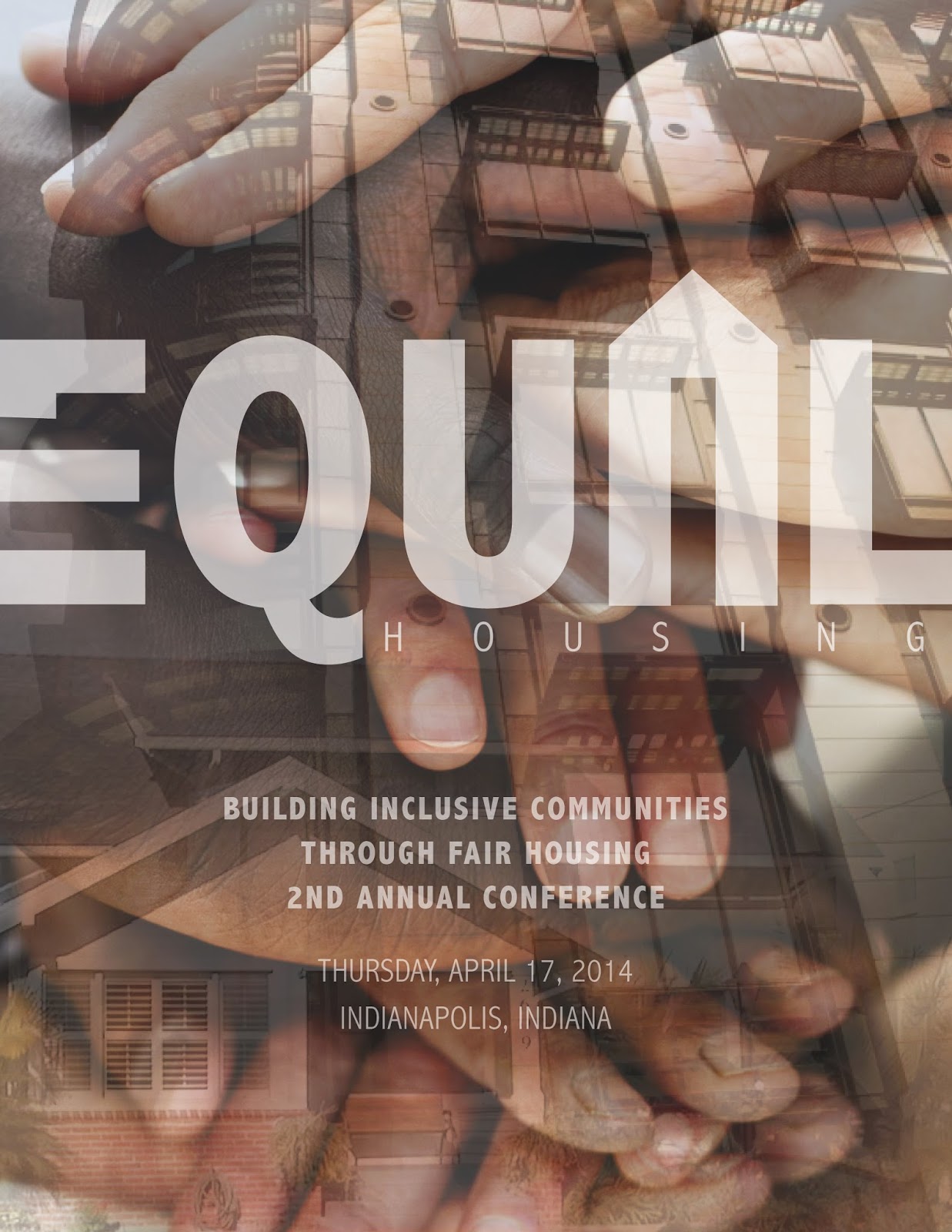
I was hired as a freelance designer to create a look for the 2nd Annual Fair Housing Conference, hosted by the Fair Housing Center of Central Indiana (FHCCI). I competed against another artist for the final project, and was victorious. As a result, my design will be used as the conference program cover and for various marketing materials. In addition, the background will be utilized for the event's signage.
When given the opportunity to create this cover, I instantly gravitated toward my passion, graphic design and branding. At the center of any successful branding campaign is a strong logo. First, I began by creating a logo to explicitly express FHCCI's mission by modifying the text to incorporate an equal sign and house into the word "equal" itself and added the word "housing" underneath for clarification. The background combines layered images of different types of housing, which literally build a strong community, and hands of various races, which figuratively build a strong community. As the layered shades of brown create a strong composition, different races work together to build an enduring community.
March 23, 2014
The Mid-American Regional Center Branding
 |
| Business Card Front (left) & Back (right) |
 |
| Folder Outside Front (right) & Back (left) |
 |
| Folder Inside (One Pocket) |
 |
| Inside Content Page 1 |
 |
| Inside Content (Pages 2-3) |
 |
| Inside Content (Pages 4-5) |
 |
| Inside Content (Pages 6-7) |
 |
| Projects Card (Housed in Back Pocket) |
 |
| Envelopes 9"x12" (left) & #9 (right) |
 |
| Letterhead |
Branding: The Mid-American Regional Center
The Mid-American Regional Center, or TMARC, is a group of lawyers that sets up and supports foreign investments in American companies. This new partner company of Taft's is set to launch in the late spring of 2014. As a part of Taft, its marketing department was tasked with branding the fledgling company. My boss, Maria Porter, designed TMARC's logo before I became an intern. However, the rest of the branding, including the business card and collateral items above, was left up to me.
While associated with Taft, The Mid-American Regional Center is its own entity. To show this, I utilized a combination of strong diagonal and horizontal lines as key design elements. The diagonal lines promote this companies' connection by mirroring the flag's slant in TMARC's logo as well as reflecting the backslash in Taft's logo. In contrast, the horizontal lines reflect the flag's stripes, a design element unique to TMARC.
This project taught me a new skill, branding. While working with in-house marketing teams has given me a lot of experience upholding and designing within a pre-established brand image, this was my first real world experience creating something from scratch. Translating the TMARC image across multiple media presented challenges, allowing me to employ my design problem solving skills. While the project is still underway, it's rewarding to be the driving force behind TMARC's brand growth.
Subscribe to:
Posts (Atom)